.jpg)
End of an Era: Windows Ditches Blue Screen of Death for Softer Error Messaging
Windows users have grown accustomed to that dreaded blue background with white text – the Blue Screen of Death (BSOD). For nearly three decades, it has been the universal warning sign of a serious system failure. But now, Microsoft is finally moving away from the traditional BSOD, replacing it with a more modern, user-friendly, and visually appealing error screen. Here’s why this change matters—and what it says about Microsoft’s vision for the future of computing.
1. The Digital Equivalent of a Heart Attack
The BSOD was introduced in the early days of Windows NT, serving as a hard stop when the operating system encountered an unrecoverable error. It became a visual hallmark of Windows instability, often accompanied by cryptic messages and stop codes like 0x0000007B or IRQL_NOT_LESS_OR_EQUAL. While informative for developers, for most users these screens were inscrutable, stressful, and infuriating.
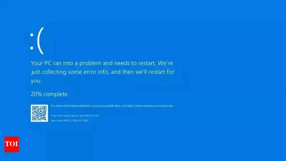
Over time, Microsoft began softening the edges—adding a sad emoticon, suggesting automated restarts, and eventually pointing users to online support. But the core experience remained the same: a sudden halt to productivity, with users left to decipher unfamiliar codes or wait for a tech-savvy friend to troubleshoot.
2. Why the Change Now?
A. Modern User Expectations
Users today expect operating systems that resemble apps more than enigmas. Apple’s macOS has its occasional hard shutdowns, but these are rare and framed in user-friendly language. Mobile platforms like iOS and Android largely abstract system failures away from users. Microsoft recognizes that the BSOD, with its stark visuals and technical jargon, is out of step with current expectations.
B. Windows as a Consumer OS
Windows has evolved from its PC-centric roots into a platform for tablets, convertibles, and even handheld gaming PCs. With new form factors and usage scenarios, a theoretical developer-centric screen doesn’t fit. Microsoft needs error messages that clearly explain what went wrong and how to fix it—no screen of panic necessary.
C. Reducing Technical Support Load
Tech support logs are full of BSOD-triggered panics—screenshots, frantic calls, tweets. By providing clearer diagnostics and guided recovery, the company aims to reduce the volume of support escalations, enabling users to resolve issues without external intervention.
3. What the New Error Screen Looks Like
Microsoft previewed the upcoming redesign: a softer color palette, a concise error message, and a friendly tone. Gone are long hexadecimal codes; instead, users see a visual indicator (like a warning triangle), a short explanation (e.g., “Your PC ran into a problem and needs to restart”), and an invitation to “Learn more”. A QR code replaces the wall of text—scan it, and your phone directs you to the exact help page.
Post-restart, the system offers a clear recovery menu: Safe Mode, System Restore, or Online Troubleshooter—all labeled in plain language. It’s a far cry from the old, bulldozer screen that froze user attention with technical fatality.
4. Why Good Error UIs Matter
A. Lowering Cognitive Load
The original BSOD forced users to transcribe error codes or wait for log reviews. The new UI eliminates guesswork, providing clear next steps. This matters not just for powered-down users; it helps decision-making in enterprise and IT support, too.
B. Enhancing Brand Perception
An operating system that feels reliable builds confidence. A friendly, modern error screen reflects Microsoft’s repositioning—from legacy Windows toward a unified, polished platform that includes Surface, Xbox, and Azure. A redesigned error experience strengthens that narrative.
C. Aligning with Fluent Design Language
The new error screen slots into Microsoft’s Fluent Design System, which emphasizes simplicity, light, and coherence. Consistency across reboot messages, system notifications, and even first-time setup flow makes Windows feel intentional—not inconsistent.
5. Behind-the-Scenes Transition
Several teams collaborated to replace the BSOD:
-
Engineering: Working on kernel-level improvements to minimize crashes.
-
UX and Design: Creating approachable visuals for what was once a dreaded interruption.
-
Localization: Updating phrasing, QR code references, and support links across languages.
-
Telemetry and Recovery Tools: Analytics now reveal what errors users run into and at what frequency, allowing Microsoft to generate better help content.
The shift likely involves rolling out the new screens first to Windows Insider builds, followed by gradual, staged deployment through public Windows updates.
6. Will This Prevent Crashes?
Let’s be clear: this redesign won’t eliminate crashes. Hardware failures, driver conflicts, rogue software, and firmware bugs will still happen. But by reframing how these failures are communicated, Microsoft is taking a more empathetic clerical role rather than a rigid executioner role.
Rather than leaving users stranded, Microsoft is equipping them with recovery paths and real-time resources—potentially saving hours of frustration, lost work, and tech support costs.
7. The Bigger Picture: Error Culture in Tech
The BSOD belongs to an era when PCs were lab beasts and users were expected to "own" their machine. Today’s tech culture prioritizes seamless experiences and hides complex failures behind easy solutions—like graceful reboots, backup file recovery, and cloud-synced settings.
Microsoft is not alone in this. Large platform players—Apple, Google—embrace gentle failures. But Windows users, long accustomed to confronting failure on a blue screen, now join the era of graceful failure. Whether it’s “Error loading app” or “Oops, something went wrong,” the aim is consistently helpful, not harsh.
8. What This Means for You
-
Expect to see windows labeled “Something went wrong” instead of the classic blue doom screen.
-
During early Insider builds, users might test the new screens and offer feedback.
-
Once the feature is stable, it’ll make its way to the general public—you’ll encounter fewer panicked messages and more human-centered recovery steps.
-
Tech support may pivot away from code lookups toward guided diagnostics tied to the QR code or troubleshooting links.
9. What to Watch Next
-
Will it land in Windows 12? Possibly—new refreshes may ship with the updated crash screen across devices.
-
Will it extend to interaction surfaces like Surface Hub, IoT, or Xbox? It’s likely, as Microsoft integrates its platform messaging across categories.
-
Will this lead to deeper system stability? A reduction in crashes would be ideal, but less dramatic error communication is the real immediate win.
Windows’ Blue Screen of Death has been a symbol of frustration and mystery for decades. Its discontinuation marks not just an aesthetic change, but a philosophical one: Microsoft wants to humanize failure, support users, and align Windows with modern expectations.
A calming screen won’t fix every error, but it signals respect for the user’s time, understanding of their emotional state, and a commitment to progress. So when Microsoft rolls out this update, don’t be surprised if your next crash encounter is curious—bright, helpful, and not blue. In an era of dark mode and silent updates, even the error screen is getting an upgrade—and you probably won’t miss the blue.
Ask ChatGPT